Forging Ahead: Herding Cats
One of my pet peeves about many community maps is what I call Metal Dungeon Syndrome (MDS). Symptoms include excessively closed in spaces, short sight lines and hard corners, and an abundance of ‘cover’ with the visual appeal of scrap littering the battlefield. It rears its head on smaller maps especially, which are usually constructed entirely out of Forge objects. The end result is a lack of clarity about how a map flows, leaving players to wind their way through the metal and glass Forge pieces wondering where they’ll end up. The best community maps tend to be more open, with cleaner sight lines and identifiable flow.
One of the reasons I enjoy BTB is because maps at that scale generally require a more open, easy to navigate layout. Think Valhalla versus Orbital.
But whether the map is large or small, it’s important to have clearly identifiable sign posts for players to help orient themselves. It’s part of making sure maps have a clearly identifiable flow. On the maps I’ve made, the layout is generally built around a couple of large land marks that can be seen at some distance; on Crossroads they were the man cannon towers, the inverted pyramids and the tall wall along the front of the bases. The goal was to try and help people stay oriented, because that map didn’t leverage any of the native Forge World geometry.
However, there are other, smaller signals that influence player movement which can be just as important, among them man cannons. They’re fun to ride on, get players across the map quickly, and often lead to key control points where ordnance beacons. The central man cannons on Valhalla and Avalanche are good examples of them. They’re a big sign that says, you want go this way.
All of which is a preamble to what I did wrong with Sandybridge.
In the first minute of the first play test on Sandybridge, I could tell things were awry: everyone spent all their time on the bridge, with the beach and island underutilized. And the sad thing is, I knew instantly why. One would think I could notice these sorts of things while I’m building them, but no.
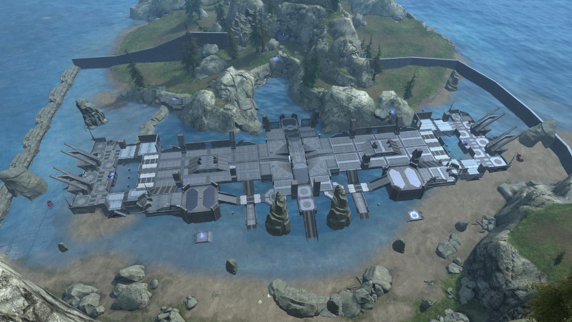
Because of the scale of the map and the way the three structures are segmented, I utilized a number of man cannons and lifts to help move players across open spaces. The problem was, they all pointed to the same place. There were five man cannons and two grav lifts directing players onto the bridge structure. The number of man cannons I placed moving players off the bridge: zero. Worse, there were only a couple ways to get off the bridge, at the center point of the beach or at the bases.
This is how the man cannons and grav lifts moved players:
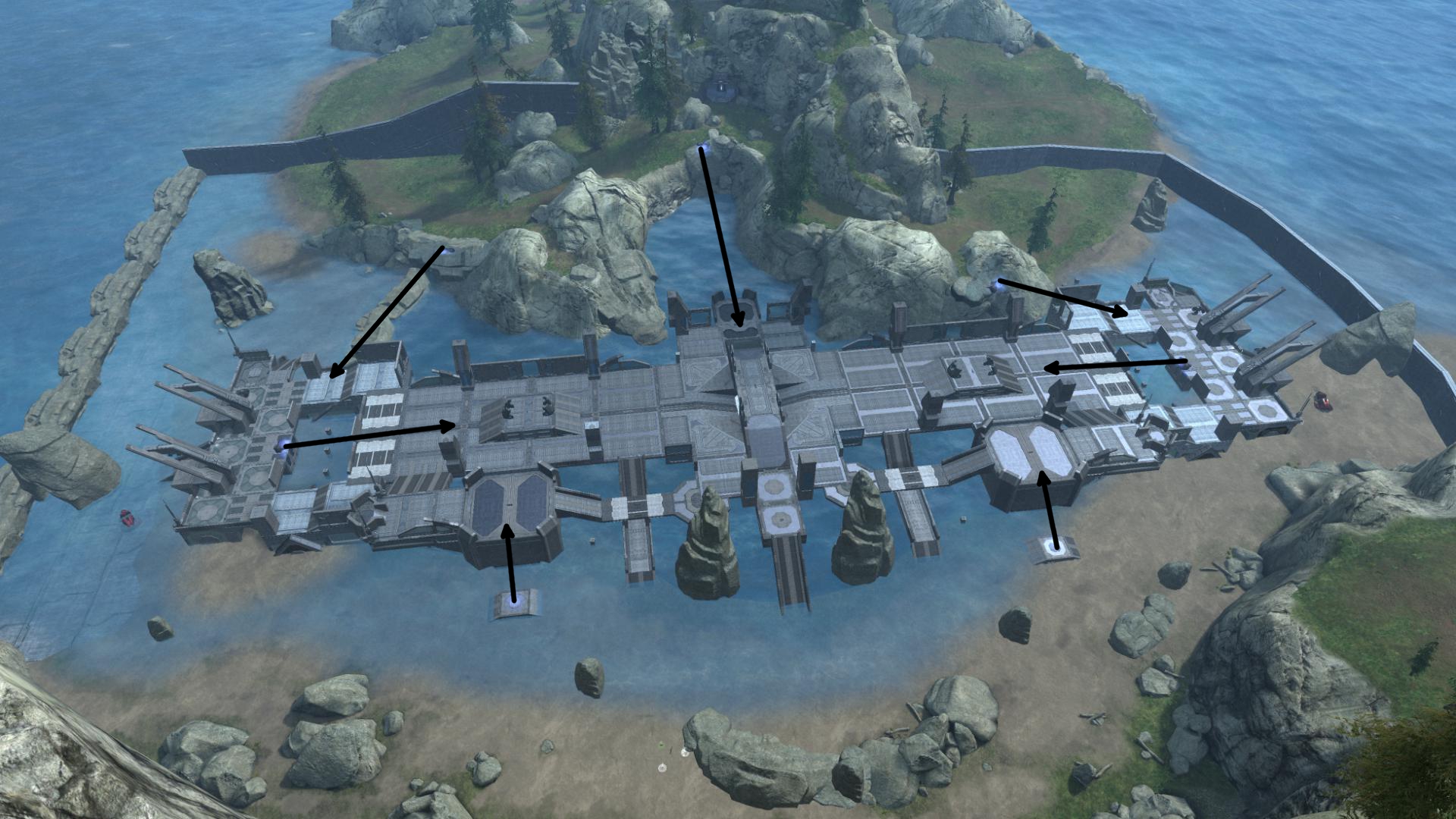
That created a huge choke point on a narrow structure as there were not enough outlets to get players off, nor enough territory for players to work around one another. I’d put up signs everywhere telling players to go somewhere, and then left them stuck.
To fix the problem, I took a step back and thought about how I wanted the map to flow, independent of how I’d actually built it.
Breaking the Bridge
The core idea behind Sandybridge was to play the three major spaces – the beach, bridge and island – off of each other. Ideally, players would be in a constant tug of war to hold territory down, or work around areas the other team held.
Being the most open of the three areas, the beach was intended as the primary place for the few vehicles to roam. Mongoose flag runs and Revenant defense/attack space was the primary goal, but with enough cover scattered about that it was viable for infantry – though not preferred, because it was vulnerable to fire from the bridge. Because the beach was a long stretch, I the teleporter in the middle, linked to the island, gave players an out if they got caught out in the open.
The island was intended to be a more sneaky infantry and CQC route. The natural geometry created a winding path with lots of elevation changes which kept players mostly sheltered from the beach and bridge. Because it was narrow, man cannons and the beach-linked teleporter were intended to alleviate the choke point.
The bridge was meant to be the high risk, high reward route. Open to attack from beach and island, it also linked the bases and was the most direct way across the map; some cookies in the form of power weapons were added incentive to try and hold the center. Man cannons from the bases gave players a nudge across part of the open space, and the central towers were a waypoint of sorts for players working across the middle.
Key to making the spaces interplay together are the linkages between them; they would need to be generous and natural. That is not what I ended up doing, of course.
My mantra as I began the rebuild was flexibility: don’t let players get locked into any one location, always give them an out – or two.
Here was the conceptual rewrite of how I wanted the new map to flow, layered atop the initial layout. This will make more sense as I work through the rebuild, but the idea was to put both more flexibility into the overall flow, utilizing the three spaces better, and to reshape the map to better communicate to players how it is intended to work.
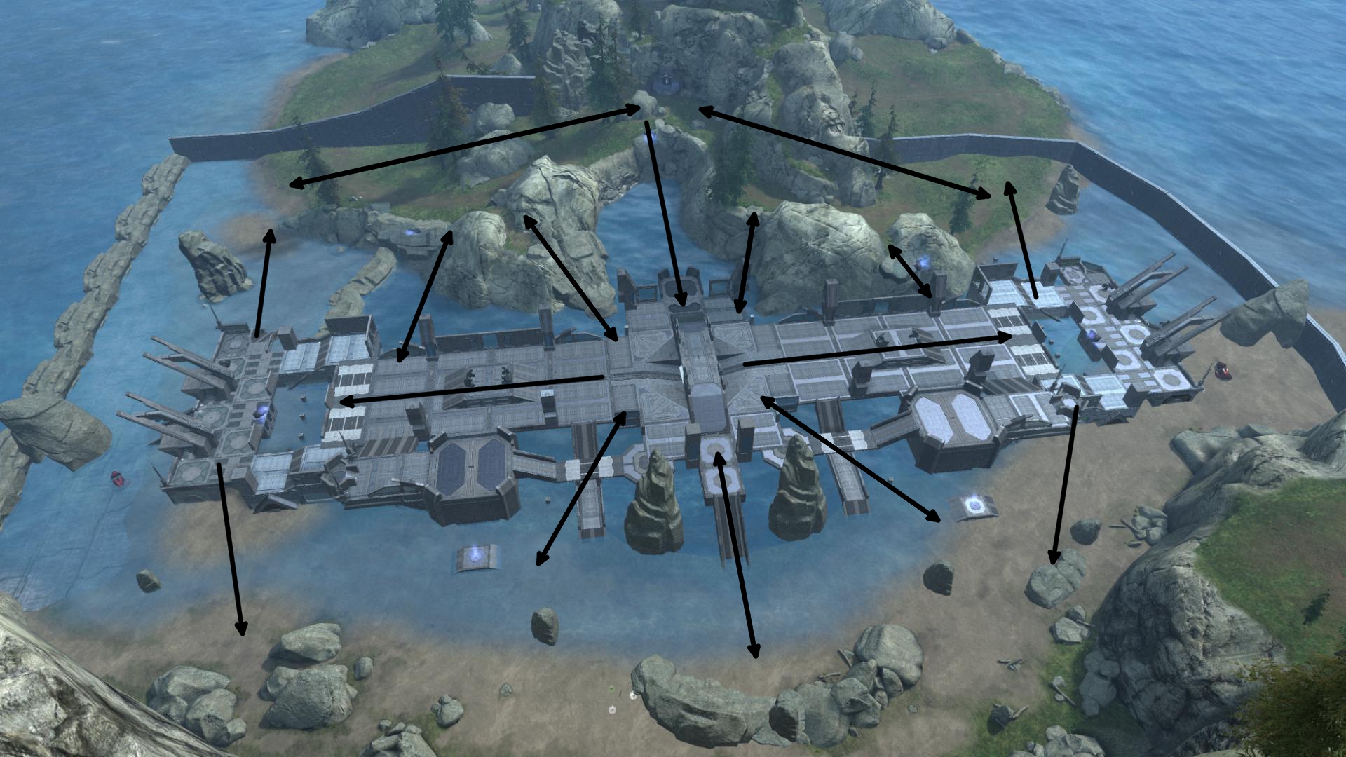
I began with the bases. Upon spawn, players saw a man cannon telling them to launch onto the bridge, which created the bottle neck. To fan players out a bit, I replaced the one forward facing man cannon with two, one aimed toward beach and one to the island. When players would converge on the central structure, they would be distributed to four locations, rather than aimed together at the center point. This would hopefully make for smaller, C-shaped clashes rather than the one massive head to head.
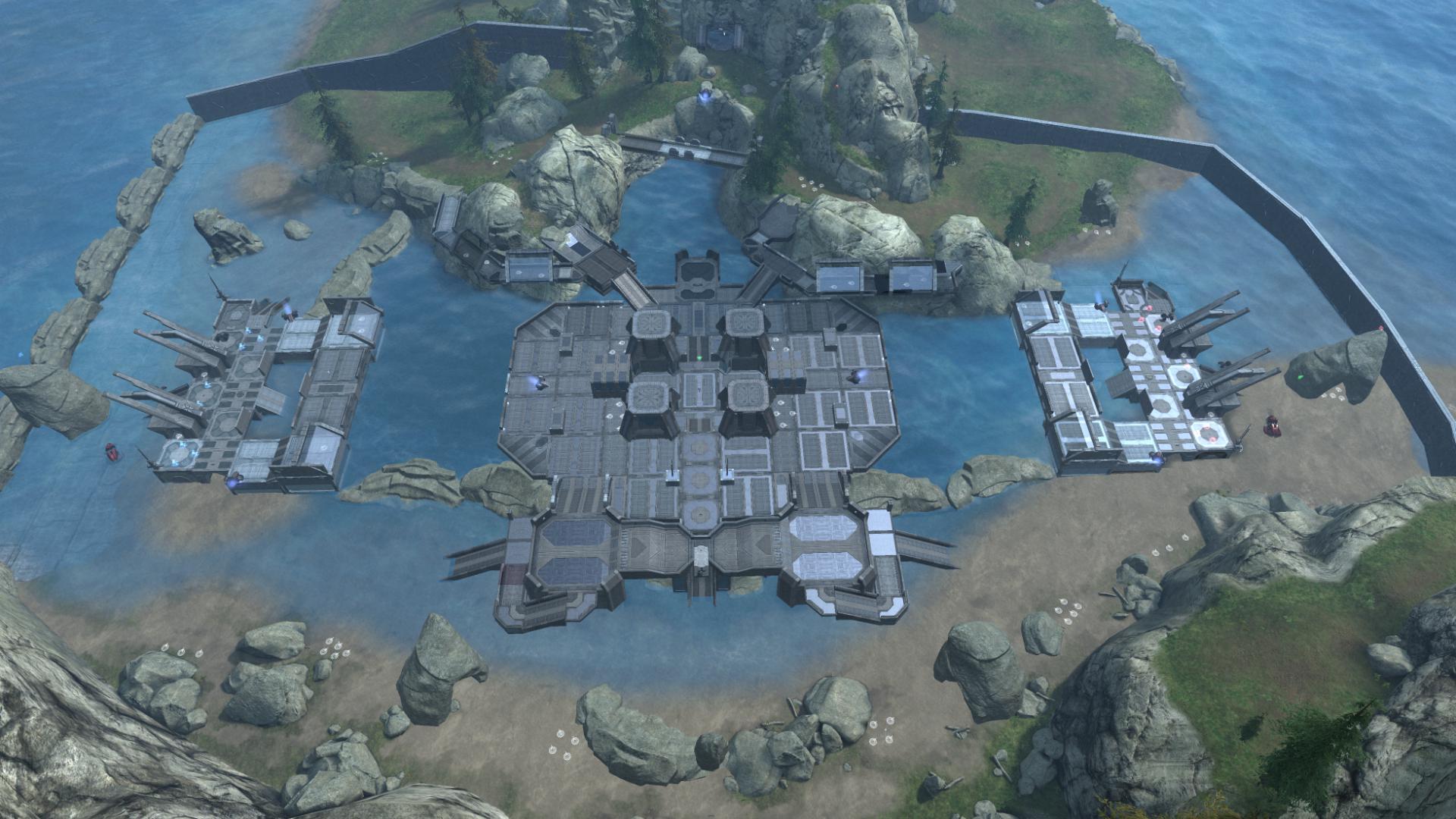
That was the (only) easy part. Now I had a bigger decision to make: back when I first built the map I debated between a central hub on the water, or a bridge. The bridge connecting the bases is part of what led to the bottleneck in the middle. My options at this point were to try and make the bridge work, or separate the central structure from the bases and re-purpose it. I opted for the latter. While this clashed somewhat with my mantra of flexibility, which I would have to make up for, I hoped to reap a dividend in the form of clarity of flow.

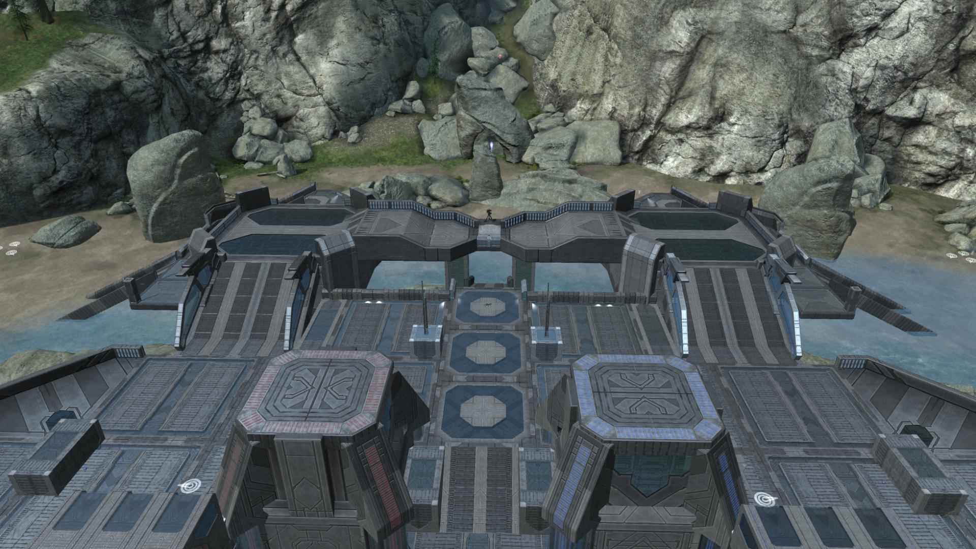
Next, I set about linking the hub (formerly bridge) to the island. This was tricky, as the geometry on the two sides of the island is not identical. But I found two places along each side that formed foot paths, and linked them to a side cat walk that in turn led to the central hub. This way players at two points on the island – on each side – could move off of it and to the hub, and like wise fan out from the hub to multiple points on the island. The walk ways were not identical in order to accommodate the different shapes of the sides, but I think they’re close enough.
Furthering my mantra of flexibility, I added a bridge running across the central bend on the island. Players could take the foot path around the outside, by the teleporter, or risk the more open but faster foot bridge. Modest cover along the sides in the form of crenellation cover pieces offer some firing points toward island or center.
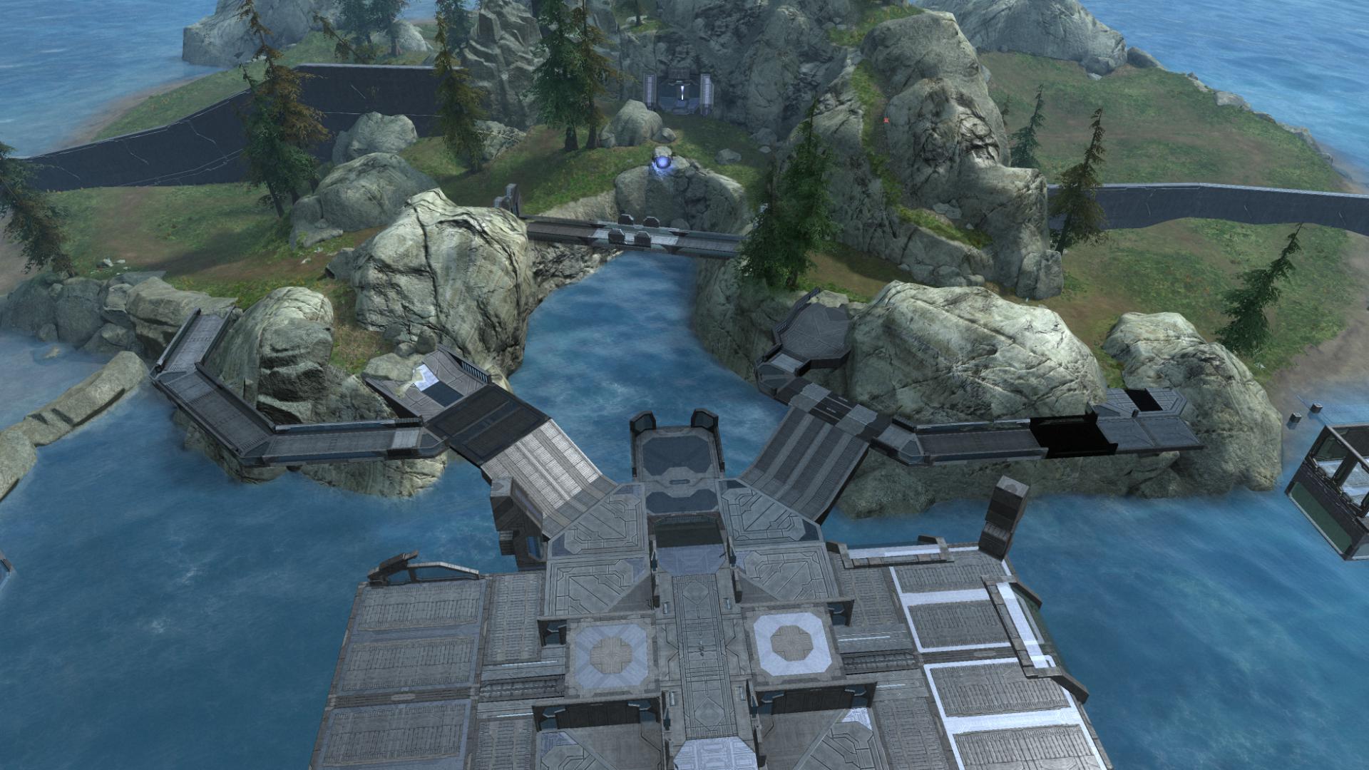
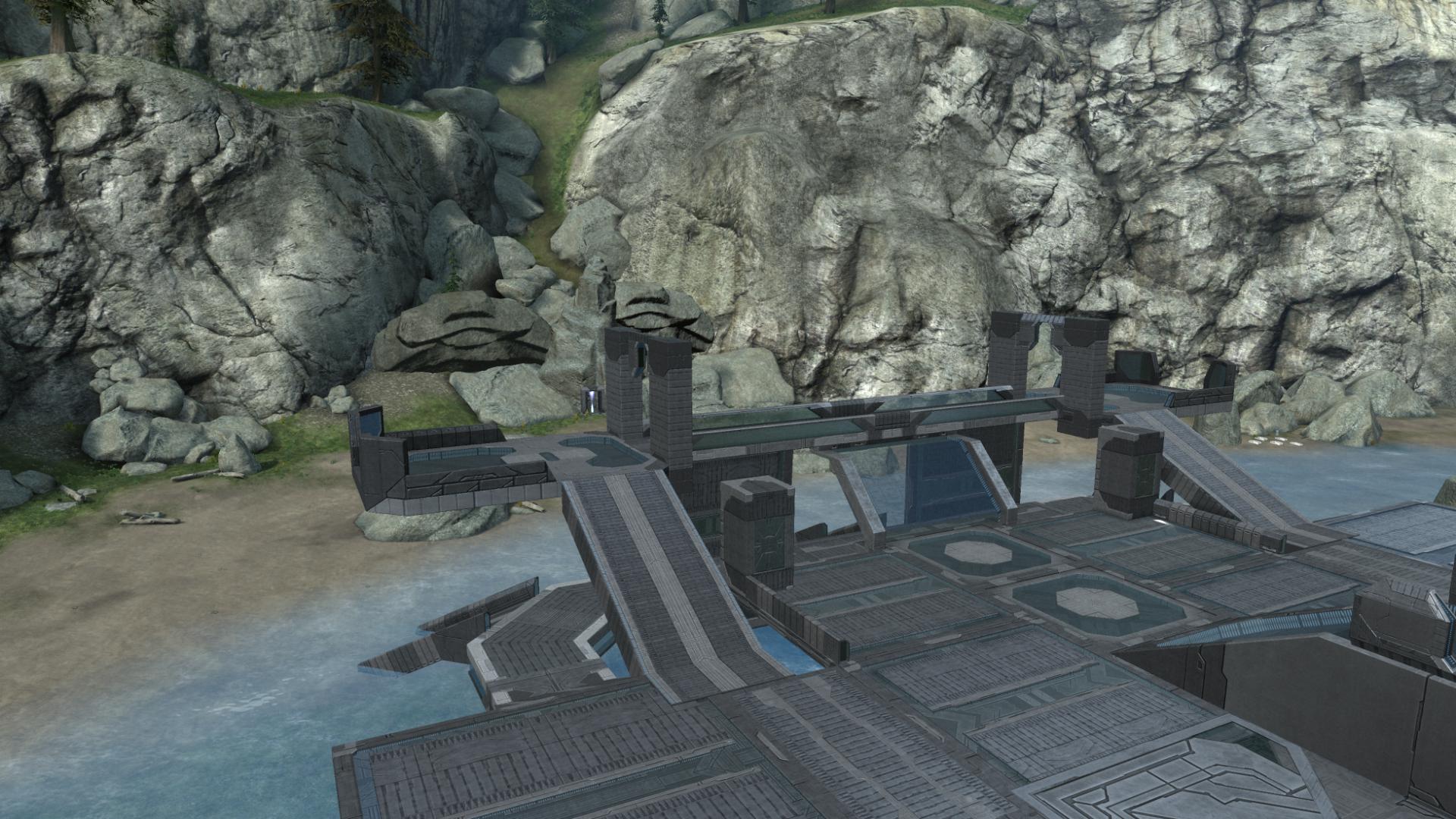
Moving on to the central hub (formerly bridge), I identified three problems, the first two of which were related. First, I had initially not wanted the bridge to touch the island (for some reason). That meant players did not have a way to get off the bridge and to the island, at all. But the second impact was to make the space narrower than it should have been, given the number of players that would be on the map (8v8).
The third problem was the elevation in the center: it was too dominating a view of the ramp to the bridge from the beach. Guys coming up the ramp ran face-first into the team holding the center, and they had the high ground. Players who took hold of middle could keep players on the beach pinned down. No one made it up the ramp in the first playtest, it was a death trap.
So rather than make the center of the hub a high point, I tried inverting it, creating a central indentation players could move through and around but would be unable to hold. The idea being to encourage movement through the middle, with outlets all around, a contrast to the rush-and-hold approach of the high ground. That would hopefully remove the perch above the ramps connecting the beach to the hub, which in turn would lubricate player movement between them. (Ahem.)
Doodle Pad
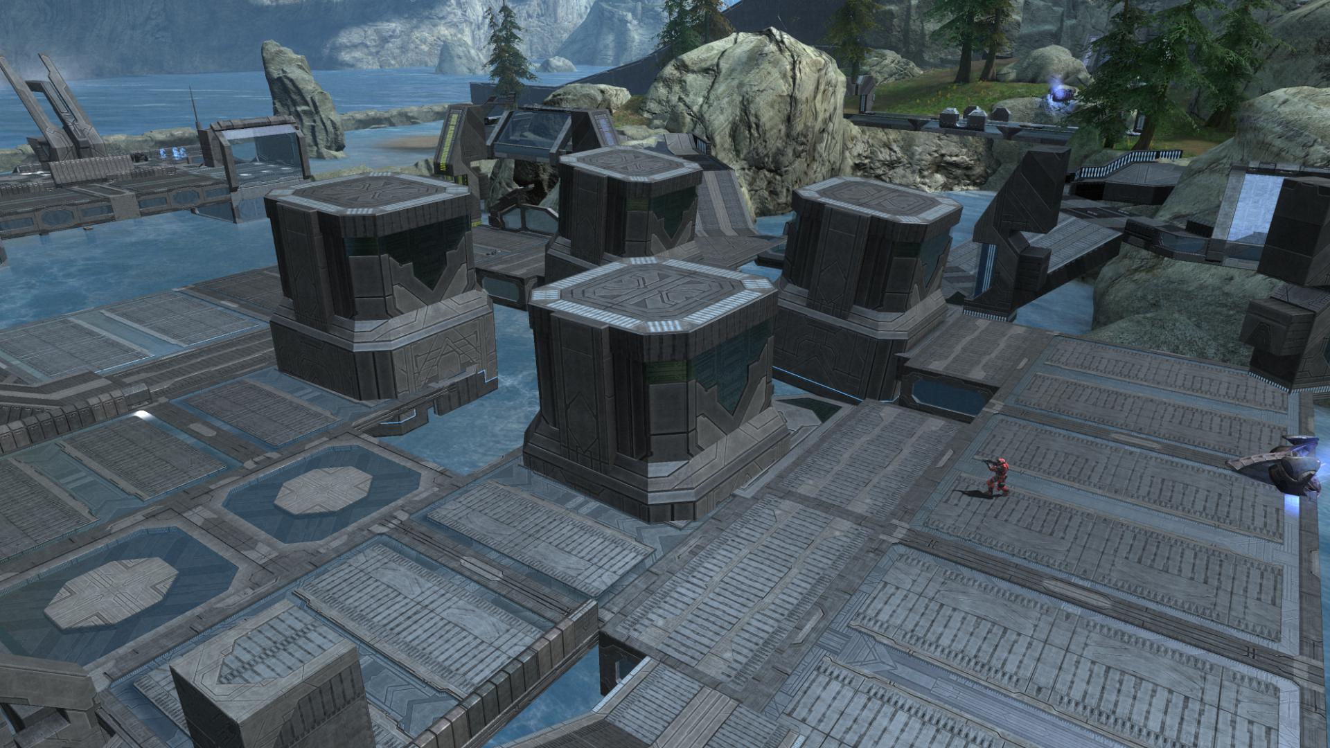
From there, I set about trying out various mass outs of the center of the hub. I spent a lot of time plopping down various objects to get a feel for the balance I needed to strike between cover and dance floor, firing lines and structural space. This was an outdoor space and the area could be seen from above, so I ruled out using walls to segment the middle as I didn’t want to make a Pac-Man maze. That lead to my experimenting with blocking off the center with pillars and towers, which would fill in space, shape player movement and provide cover.
The four large towers announced the flow around them clearly, and provided some objects to separate players from one another. It also helped give the impression of a closed space while remaining out in the open.
This was the initial flow mass-out.
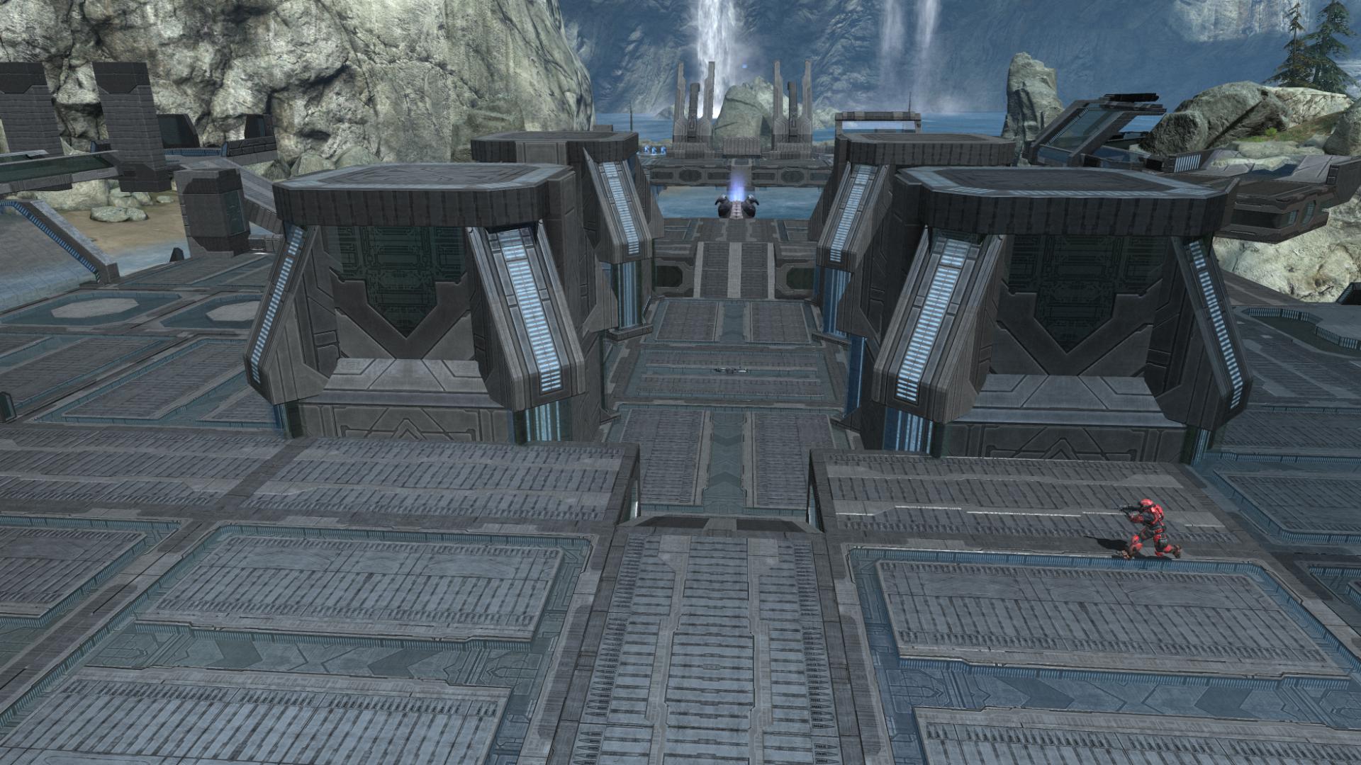
With the center massed out, I moved to the final major area, the towers off center by the beach. Their original intent was to be a waypoint along the bridge between the center and the bases, to fire in either direction. Because the bridge was now a hub, their purpose needed to change.
I decided to use them as a way for players approaching the center from either beach or island to engage each other at DMR range, exchanging fire across the hub. The central towers would provide the cover needed to let players move forward and engage without being fully exposed to the other side. With that in mind, I did a skeletal mass out that served that function.
The towers would also serve as a counter point to engage players approaching from the island, before moving to the center for the rockets. The distance was about right for some good DMR/Nerfle shoot outs. I didn’t mark it on the image below, but the space was about the same distance as between the bases and the hub, across which similar firefights would hopefully break out, before an invading team launched over to the base.

As with the initial base design and the current middle, I built a skeletal-looking structure for the towers to get a feel for how I wanted it to flow, again with a focus on flexibility. In order to make them assaultable, there needed to be multiple ways up. But the top could not be so well covered that it was a risk-free place to hang out.
At this point, the hub was looking ugly as hell, but starting to take on the general shape I thought it needed to take. I set about polishing up the central area, settling the towers in symmetrical locations and rebuilding the ground work.

With size and shape down, I did a polish pass to get final geometry in.
Spit and Polish
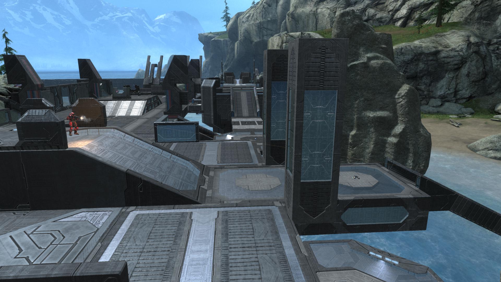
I finalized the exact location of the central towers, and spiced up the aesthetics by embedding struts in the corners to give them a Forefunner-y, reactor type of shape. My style is rather utilitarian so it was nice to get an artistic touch layered in.
From the center, I evaluated how the sight lines worked looking up at the surrounding areas, and decided the towers near the beach would be too dominant unless I gave players leaving the middle more shelter. I added the tunnel pieces along the side exits. That had the added benefit of further segmenting the space and creating some pockets on the corners for player downtime.
Finally, I came back to the towers off to the sides to replace the doodle.
I went back to using the largest of the platforms, as they had more ample dance floor and filled in the corners of the central hub, shaping the sight lines to the beach so the center was not too open. The linkages between them and the hub were similar to the previous design, with the addition of a secondary route up along the sides.
I rounded out the sides of the hub facing the bases with some large corner pieces to add some additional dance floor and give it a more circular shape. I spent a long time dabbling with various ways to add cover to that space, which I’ll touch on in the next piece. After several hours of banging away, I had refined the center from the rough mass out to something more polished.
Because of the additional man cannons on the bases, I had to remove the grav lifts that took players from the beach directly onto the towers. They were intended as a way for people to launch a stealth attack on anyone entrenched on the towers, and I’d still prefer that method. But to use them, I’d have to sacrifice the central man cannon from the beach to the hub, and that was too critical a feature to lose, so I replaced the grav lifts with a ramp way. Because the towers were tall, a straight ramp from the top to the beach would give players on the top too strong of an angle to fire on players using the ramp. So I segmented the ramp into two parts, letting players get up alongside the tower more quickly for a hopefully stealthier entry point to players on top.

After the spit and polish pass, the layout was complete. Here’s the comparison of Sandybridge to, well, what it turned into:
This has been a pretty lengthy update, and I’ve kept most of the look at a pretty high level. But I have a bin list of a zillion details I want to talk about, because they were important and difficult. Among them: developing movement loops around the map, adding cover to the beach, the spawn placement and objective design, some tweaks to the bases, and finally, the results of the first playtest on the new version. So for the next piece, I’m going to zoom in a bit and go over some of the finer details and thought processes I didn’t touch on this time around, and how they played out.
Be First to Comment